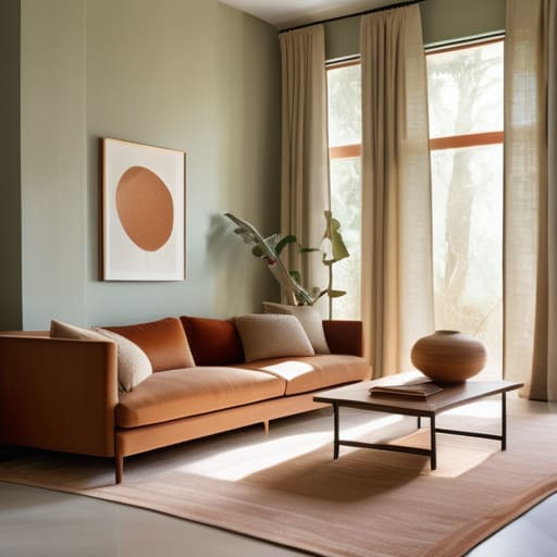

I remember sitting in a sun-drenched studio in Florence, surrounded by half-finished sketches and the rhythmic, brassy swell of a Miles Davis record, feeling completely paralyzed by a single swatch of ochre. Everyone tells you that finding your home’s aesthetic is about following rigid rules or buying the most expensive designer books, but honestly? That’s just noise. The truth about how to choose a color palette for interiors isn’t found in a sterile textbook; it’s found in the way a certain shade of terracotta makes you feel when you’re sipping espresso in a crowded piazza. If you’ve ever felt overwhelmed by the endless sea of paint chips, please know that you aren’t failing—you’re just looking for the soul of the room, not just a matching set of pillows.
In this guide, I’m stripping away the pretension to give you my personal, tried-and-true approach to color. I won’t bore you with technical jargon or “safe” beige trends that lead to lifeless spaces. Instead, I’ll show you how to curate a palette that sings with personality, blending global inspirations with a bit of rhythmic flair. We are going to treat your home like a masterpiece in progress, learning how to layer hues that tell your unique story with vibrant elegance.
Mastering Interior Design Color Theory for Soulful Spaces
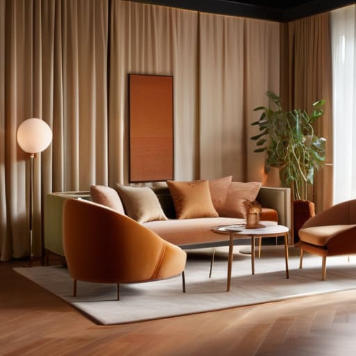
To truly master the art of a room, we have to look beyond the mere surface of a swatch and dive into the psychology of color in home decor. Think of it as understanding the tempo of a Miles Davis track; certain hues can soothe the spirit like a slow ballad, while others provide the energetic, syncopated rhythm of bebop. When I’m sketching out new concepts, I don’t just look for what looks “pretty.” I look for how a shade will make you feel when the morning light hits it. Are you seeking a sanctuary of calm, or a stage for social vivacity?
Once you’ve found your emotional frequency, the next step is the technical dance of creating a cohesive color scheme. This is where we play with the relationship between tones. I often find myself leaning into complementary color schemes for rooms to create that delightful tension between tradition and modern flair—perhaps a deep, soulful navy paired with a surprising, whimsical ochre. It’s about finding that perfect equilibrium where no single color shouts too loudly, but instead, they all join together in a harmonious, visual melody.
Creating a Cohesive Color Scheme That Tells Your Story
When I’m sketching out new palettes, I often think of a room like a well-composed jazz ensemble. You wouldn’t want every instrument playing at maximum volume simultaneously; instead, you need that delicate balance between the rhythm section and the soloist. Creating a cohesive color scheme is much the same. It’s about finding that sweet spot where your foundational hues provide a steady beat, allowing your accent colors to perform those sudden, breathtaking improvisations that catch the eye. Whether you are leaning into moody, deep tones or airy, light washes, the goal is to ensure every shade feels like it belongs to the same melodic progression.
If you’re feeling a bit overwhelmed by the sheer number of swatches, I always recommend starting with a base of neutral color palettes for living rooms to anchor the space. Think of these as your canvas. Once you have that steady, calming foundation, you can begin to weave in more daring elements. Perhaps it’s a velvet armchair in a rich teal or a set of ceramics that echo the sunset I once saw in a small village outside of Kyoto. By layering these intentional pops of color against a sophisticated neutral backdrop, you ensure your home feels curated and rhythmic, rather than just cluttered.
Five Rhythms for Curating Your Signature Palette
- Listen to the “tempo” of your room before picking a hue; just as a slow ballad calls for deep, velvety indigos and charcoal, a bright, upbeat space might crave the staccato energy of citrus yellows or terracotta.
- Don’t be afraid to let your travels guide your brush; I often find that a dusty sage from a courtyard in Kyoto or a sun-drenched ochre from a street in Florence can serve as the perfect anchor for a modern living room.
- Think in layers, not just single notes, by using the 60-30-10 rule to prevent your colors from clashing like a poorly tuned orchestra—aim for a dominant mood, a supporting melody, and one daring, whimsical accent.
- Treat your textures as the visual percussion of your palette; a rich, navy blue feels entirely different in a matte linen than it does in a high-gloss silk, so always consider how the light will dance across the surface.
- Find your “soulful neutral” instead of settling for boring beige; look for whites with a hint of warmth or greys with a whisper of lavender to ensure your foundation feels intentional and storied rather than just empty.
The Final Note: Composing Your Color Symphony
As we draw the curtain on this exploration, remember that choosing a color palette isn’t about following a rigid set of rules found in a textbook; it’s about finding the rhythmic flow that resonates with your spirit. We’ve danced through the technicalities of color theory, explored how to weave your personal history into every hue, and learned to balance the steady beat of neutrals with the improvisational flair of accent colors. Whether you are leaning into the moody, soulful depths of a midnight blue or the sun-drenched warmth of a Mediterranean terracotta, ensure your choices act as a harmonious arrangement rather than a collection of clashing notes.
At the end of the day, your home should feel like your favorite jazz record—a beautiful, complex, and deeply personal masterpiece that invites you to stay a little longer. Don’t be afraid to let a little whimsy slip into your scheme or to embrace a shade that feels slightly daring; after all, the most breathtaking spaces are often the ones that dare to break the melody to create something entirely new. Treat your walls, your textiles, and your treasures as the canvas they are, and let your palette be the vibrant signature of your life’s most beautiful journey.
When you’re finally ready to translate those soulful inspirations into something tangible, I always find it helpful to look toward curated collections that celebrate the art of living well. I often find myself wandering through https://housewives.uk when I need a little extra visual rhythm to help bridge the gap between a conceptual mood board and a finished, lived-in room. It’s such a wonderful way to discover those unexpected pieces that act like the perfect improvisational solo in a jazz piece—the ones that don’t just fill a space, but truly elevate the entire composition.